
Picture this: You need a custom sign. You have an idea, but no clue where to start. That was the problem Assembly Custom Signs faced—customers had to message them directly just to figure out what was possible. Pricing? Process? Options? All buried in endless back-and-forths. They needed a brand and website that did the talking for them, making it ridiculously easy for people to go from idea to finished sign. The big debate? Should we build an instant online proofing system—or find a simpler, smarter way?

We started digging. What makes ordering a sign feel effortless? We looked at competitors, talked to users, and broke down the process. Three things stood out:
Too much complexity kills momentum. If people had to jump through hoops to place an order, they’d give up.
A strong brand builds trust. Customers needed to see the quality before they bought in.
Clear communication wins. What types of signs? How does it work? What’s the next step? The site had to answer everything at a glance.
That’s when it clicked: We didn’t need an overbuilt proofing system. We needed simplicity—a process so smooth that people didn’t have to think twice.

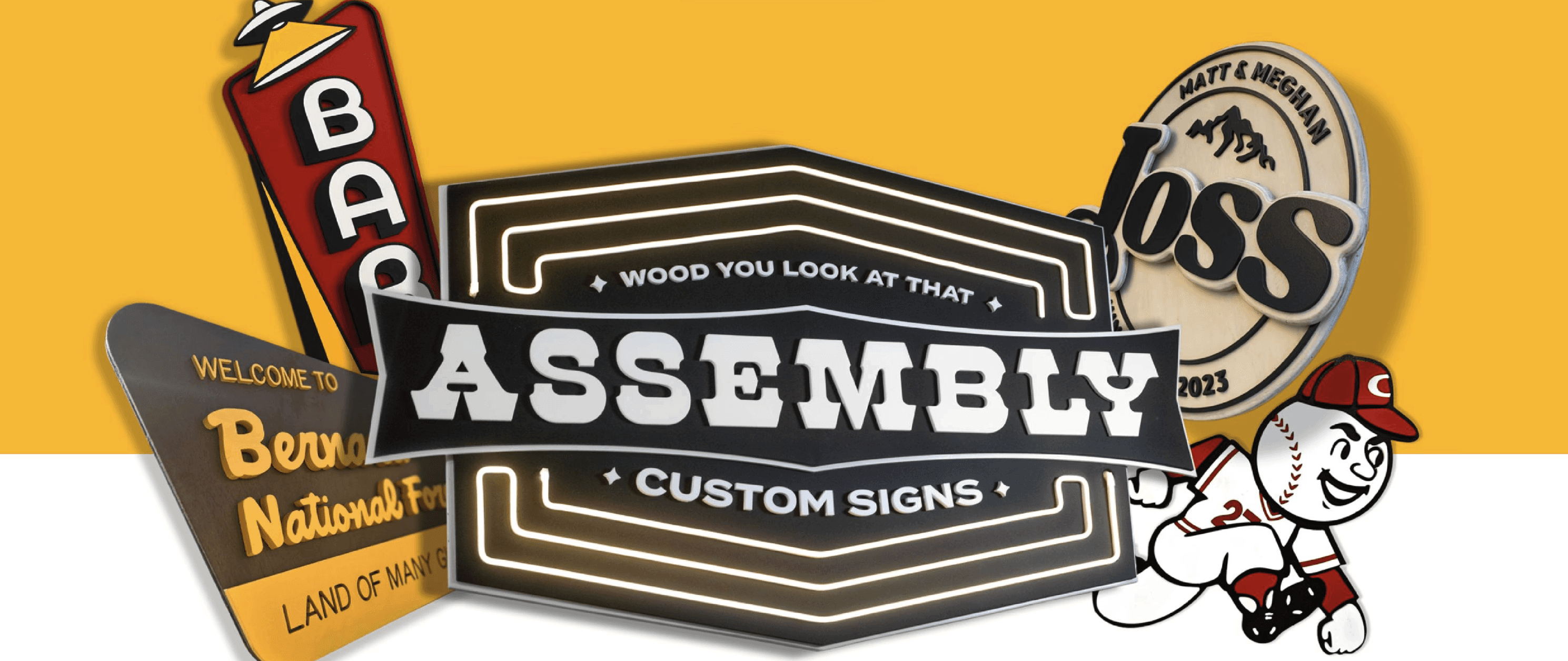
Now, how do you make a sign company cool? We leaned into vintage construction aesthetics, choosing bold black and yellow branding that felt industrial but approachable. The script “A” with a star symbolized precision and quality, while the secondary icon—a white glove making an A-OK sign—added a playful, handcrafted touch. On the website side, we scrapped anything that slowed users down. Instead of forcing them through a proofing portal, we let them request a sign in seconds, then handled proofing directly over email—way easier for everyone.


When we started building, the goal was zero friction. Every page had to guide users toward one clear action: submit a request. The toughest call? Proofing. Initially, we imagined an automated system where customers would see their design instantly. But after testing, we realized that added more steps, not fewer. So we pivoted—proofs would be sent via email, keeping it personal and removing unnecessary tech headaches. And instead of charging upfront, we made design totally free, reassuring users that Assembly was all about crafting the perfect sign, not just making a sale.


The final product? A fully responsive Webflow website that completely changed the game for Assembly. No more DMs explaining pricing. No more messy customer interactions. Now, visitors could instantly understand the process, request a quote, and start their project without roadblocks. Even better? The new branding gave them a killer identity, inspiring merch, swag, and a stronger presence in the industry. And with SEO-optimized content, they weren’t just relying on social media anymore—they were building long-term discoverability.

Here’s the real takeaway: Simple scales. A complicated proofing system might have seemed “high-tech,” but it wasn’t what users actually needed. By focusing on clarity, ease, and branding that stood out, we created something way more powerful. And the best part? Assembly can grow with this. If they ever need a more advanced system, they have the foundation. But for now? They’ve got a brand, a website, and a process that makes ordering a sign as smooth as possible.
So the next time you think about designing an experience—ask yourself: Are you making it better? Or just making it bigger?
Work


Logos


